Empowering women to take control of their health in menopause

through education, support, and personalized resources

Two iPhones with a re-designed version of Gennev's menopause assessment

Gennev is the #1 virtual care provider for women in menopause

Through its network of OB/GYNs, dietitians, and health coaches, Gennev offers health care, personalized treatments, and educational resources for menopause relief.

Project overview

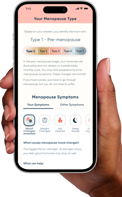
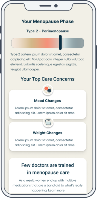
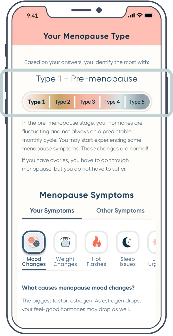
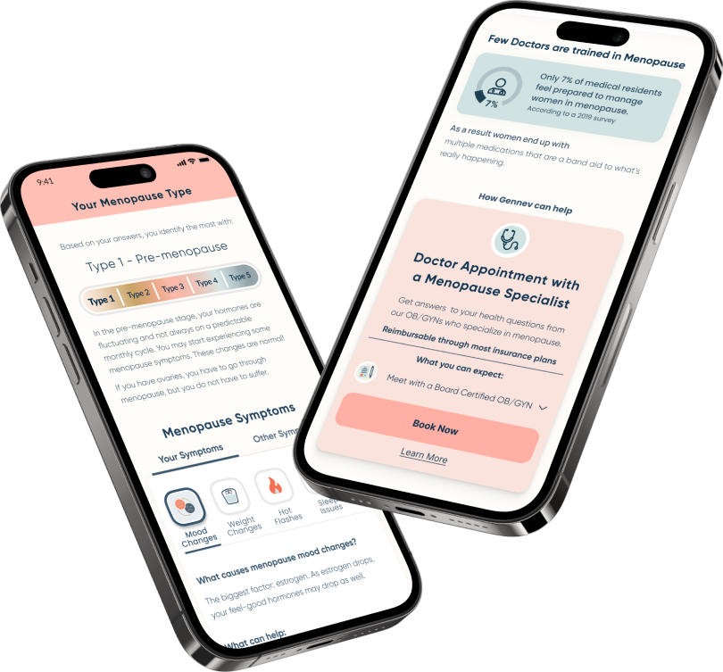
Menopause assessment and results page

Menopause Awareness Month was approaching, and Gennev knew there would be an influx of potential new patients, so I turned my attention to one of our main sources of traffic: the menopause assessment.

The menopause assessment consistently had a low click rate, and in turn, a low rate of user to patient conversions. In depth user research was in order!

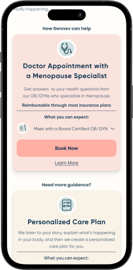
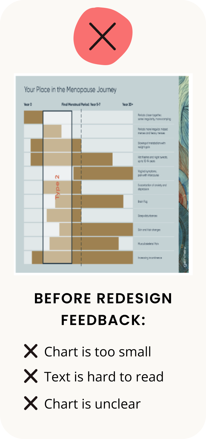
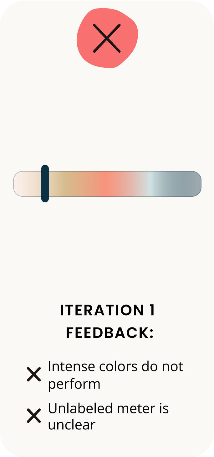
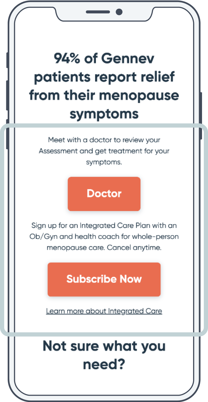
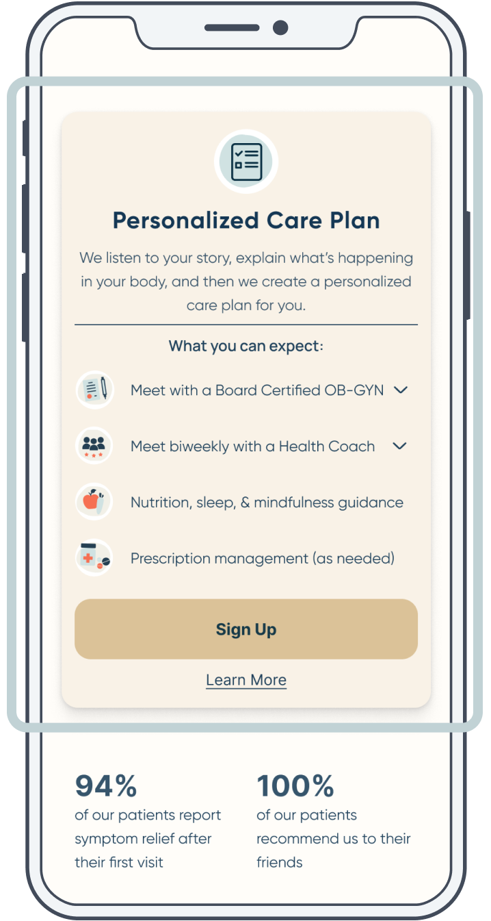
When looking at low conversion rates, there were three essential factors to consider: the assessment questions, the results, and the patient signup process. In this case study, I focused on a complete redesign of the assessment results page layout, improving the content, structure, and accessibility features.

A hand holding an iPhone with the new design. Sized for mobile.

Skills and tools

  • Competitive analysis
  • Figma
  • Quantitative research
  • Qualitative research
  • User interviews
  • Usability testing
  • High-fidelity wireframing
  • Prototyping
placeholder

Project goals

  • Educate women on the norms of menopause and how to alleviate their symptoms in a way that is approachable
  • Provide resources to help women during their menopause journey

Original design: Results page performance

Analyzing the data to understand the problem

51.6% of users complete the assessment

85% drop rate on the results page

2.7% of users who finish the assessment select a CTA on the results page

Takeaways and next steps

After evaluating the data, I assumed that the biggest opportunity was to focus on the results page. Gennev's goal of the assessment is for users to sign up for their services. I wanted to understand why the results page has a low click rate and the lowest drop rate among the assessment pages

Original design: User testing with the results page

Interviewing 10 women in menopause to uncover common pain points

Affinity diagram

Meet Robyn

  • Age: 52
  • Been in menopause for 12 years
  • Accepted menopause as a part of life
  • Visited the doctor for menopause but left with her symptoms untreated
placeholder

Robyn's pain points

Lack of competitive differentiation

The results page is text-heavy and justified to the center. The organization and amount of text overwhelmed Robyn. After a skim of the information, she still had no idea how Gennev differed from her current healthcare provider. She didn't feel empowered to take action.

Screenshot of old Gennev design
Inaccessible, unclear symptoms chart

The assessment results include a chart visualizing the user's menopause type and symptoms. The information in the chart is disorganized and hard for Robyn to follow. The text is also way too small - and she didn't have her glasses with her!

Lack of a strong
value proposition

As Robyn tried to dive deeper into her results page, she still felt unsure about what exactly Gennev could offer her.

Screenshot of old Gennev design

How might we display information in a way that helps Robyn understand her menopause journey?

Brainstorming solutions to pain points

Lo-fidelity wireframes

Lo-Fi wireframes

Design validation: Usability testing

Mid-fidelity wireframes

Mid-Fi wireframe 1 Mid-Fi wireframe 2

I conducted usability testing with the same group of women to gather feedback on my design.

User feedback on mid-fidelity wireframes

The colors of the meter make me feel like there may be something wrong with me The lighter colors feel more neutral and comforting Am I in the middle of two different types? Or - like what type am I? The icons really catch my eye - makes it easy to scan too I am overwhelmed by how much I have to read here How do I know what symptom it’s giving me info on?

Refining the design using feedback

Meter iterations

Original meter design 1st new meter design Final meter design

Menopause symptoms iterations

Original symptoms design 1st new symptoms design Final symptoms design

Addressing the pain points

Before redesign vs. after redesign

Gennev design before the redesign on iPhone

Before Redesign

Gennev redesigned page on iPhone

After Redesign

Providing competitive differentiation

Menopause training is uncommon among medical residents, but Gennev's doctors and care providers are specialized in this area. To help women understand what sets Gennev apart, I provided concrete data demonstrating this differentiation.

Providing a simple, accessible menopause type meter

To improve accessibility of the results chart, I increased the font size, making it easier to read. I also reduced the amount of information in the chart and divided it into sections to better readability and overall understanding.

Gennev design before the redesign on iPhone

Before Redesign

Gennev redesigned page on iPhone

After Redesign

Gennev design before the redesign on iPhone

Before Redesign

Gennev redesigned page on iPhone

After Redesign

Providing a clear value proposition

To highlight Gennev's value proposition, I listed out what benefits and resources users can expect from each of Gennev's offerings. I added a "Learn more" link at the bottom of each offering, which takes users to pages with more in depth information and FAQs.

Takeaways and highlights

  • Spending more time on user research and gathering feedback will give you back time in the long run
  • Design content for short attention spans
  • Focus on designing for the target audience
3 stars in a circle
Back to top ⬆️