Helping senior homeowners tap into their home equity with confidence

through transparency, easy to follow information, and educational resource

Two iPads with a re-designed version of House Numbers' design

House Numbers is the first financial advisor whose sole focus is on the home

House Numbers strives to empower every homeowner to understand and nurture their biggest asset: their home.

Project Overview

New product research and design: Reverse mortgages

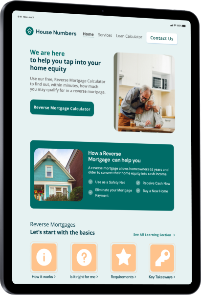
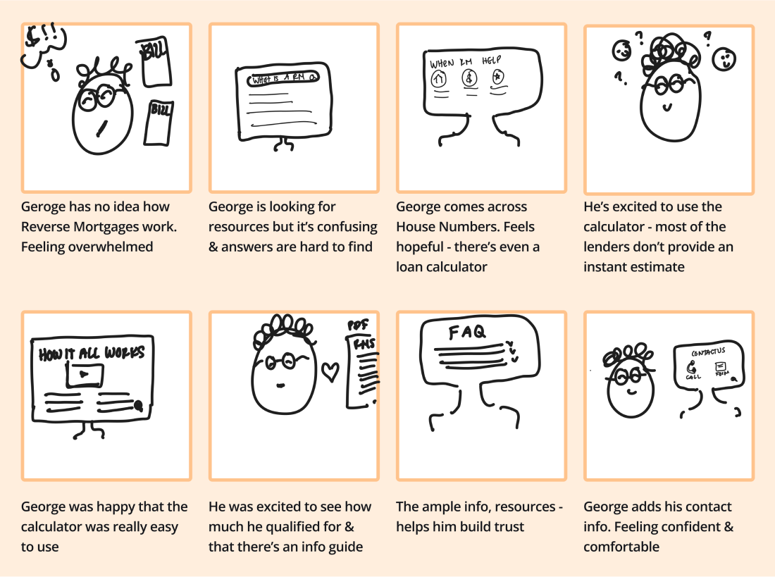
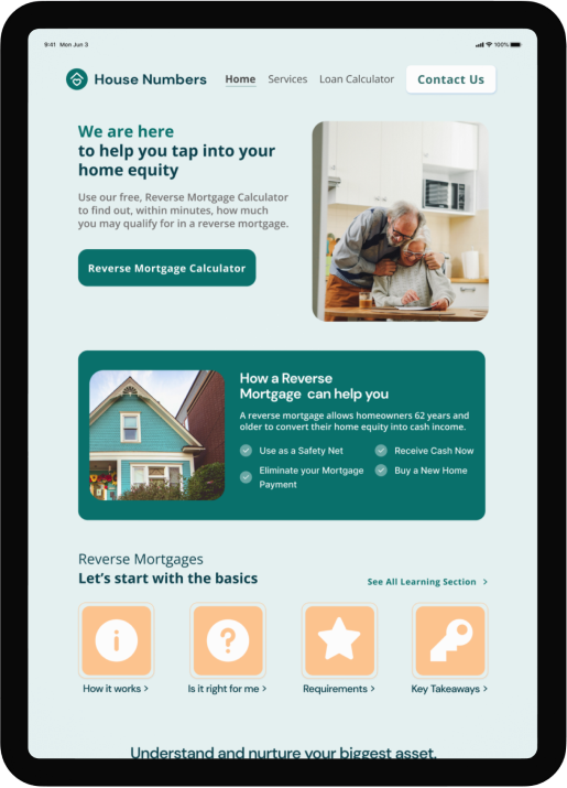
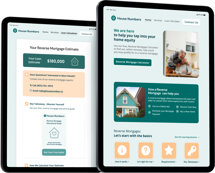
House Numbers realized a large demographic of homeowners was being overlooked: senior homeowners. To fill this gap, they decided to begin offering reverse mortgages.

A reverse mortgage is a mortgage loan that allows senior homeowners to convert home equity into cash income.

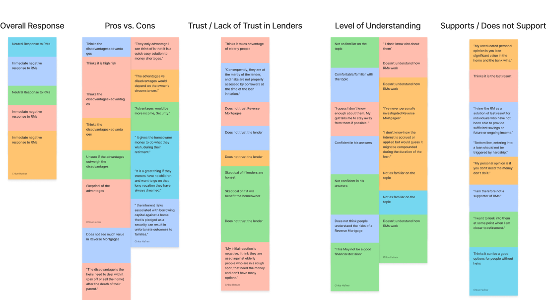
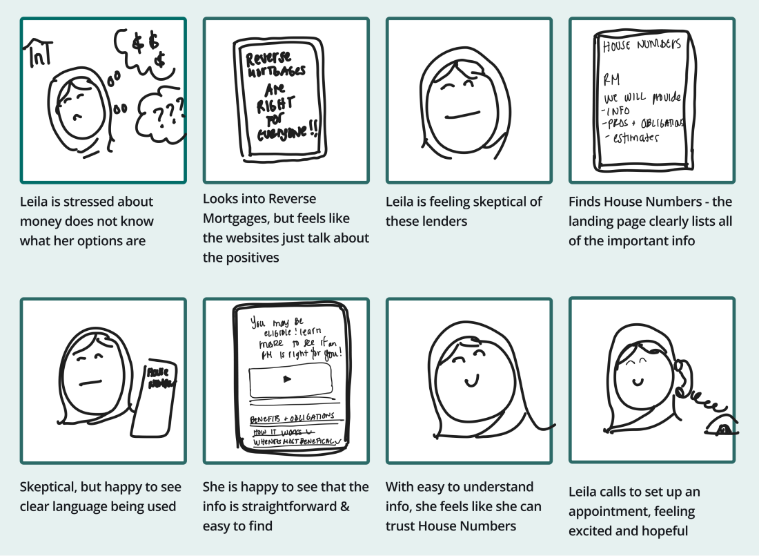
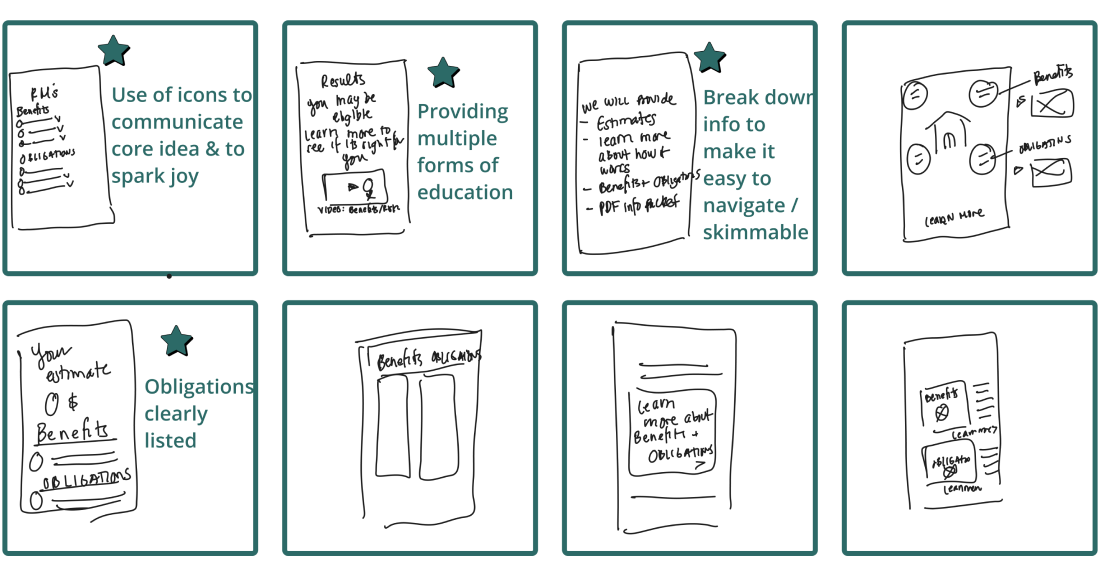
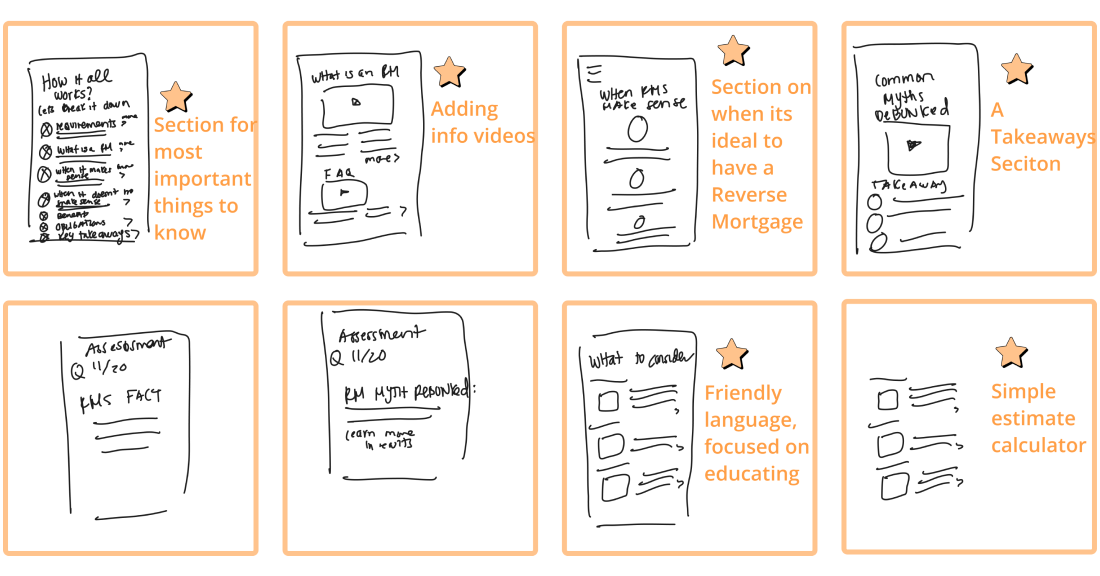
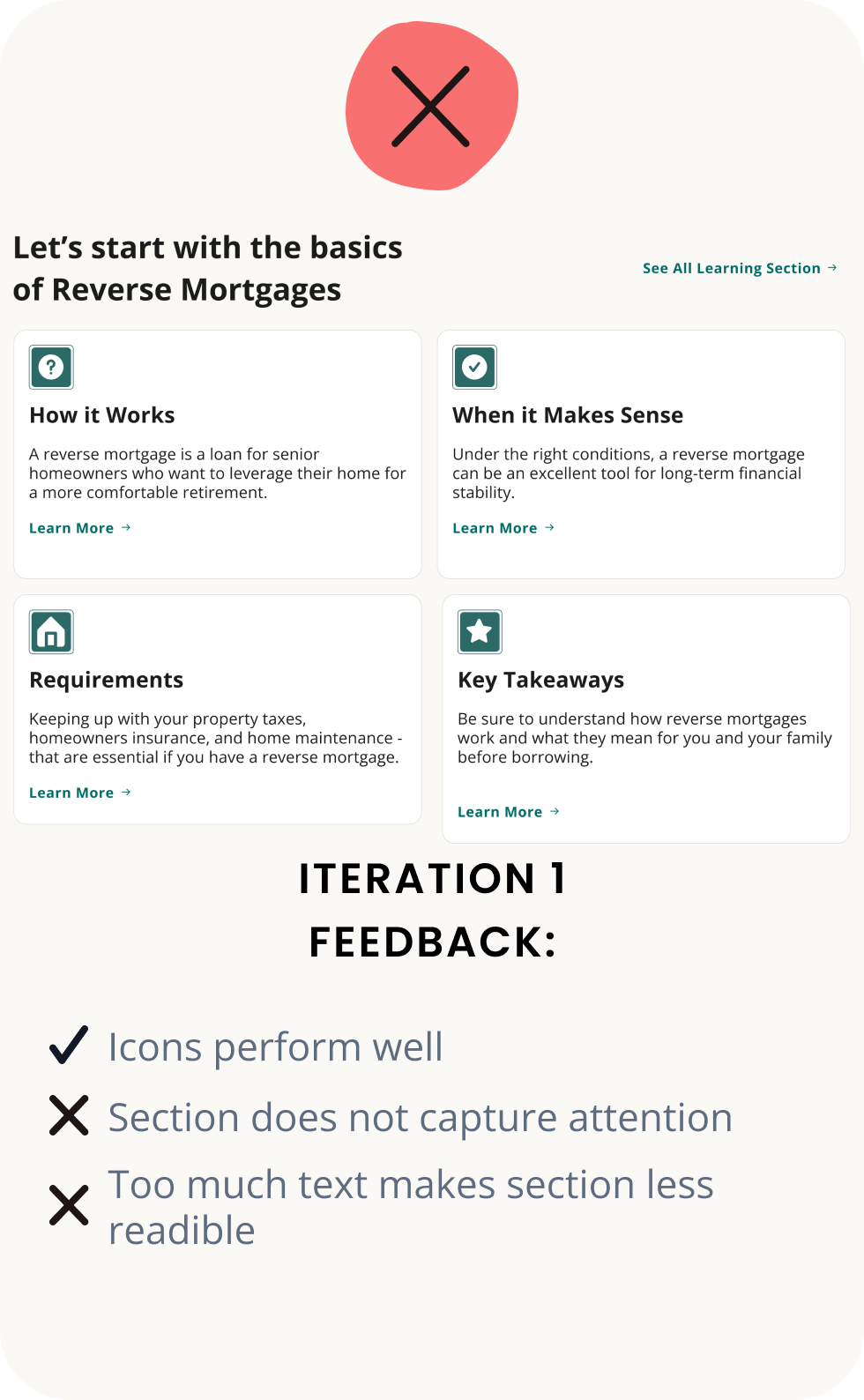
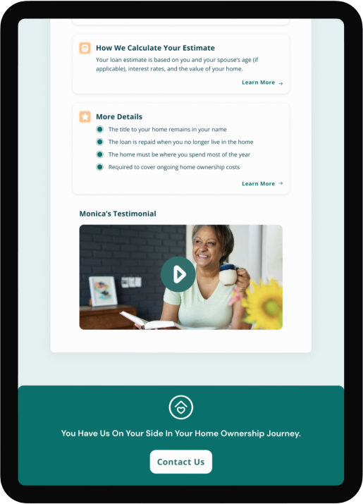
While reverse mortgages can be a great tool, they don't have a good reputation. House Numbers was looking to change the perception.

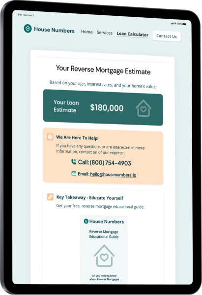
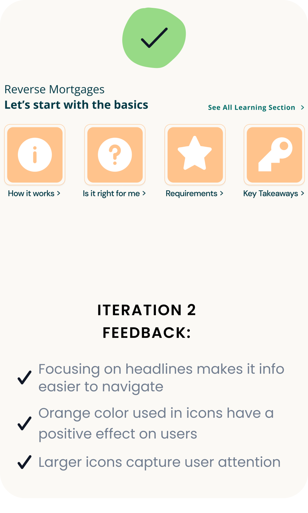
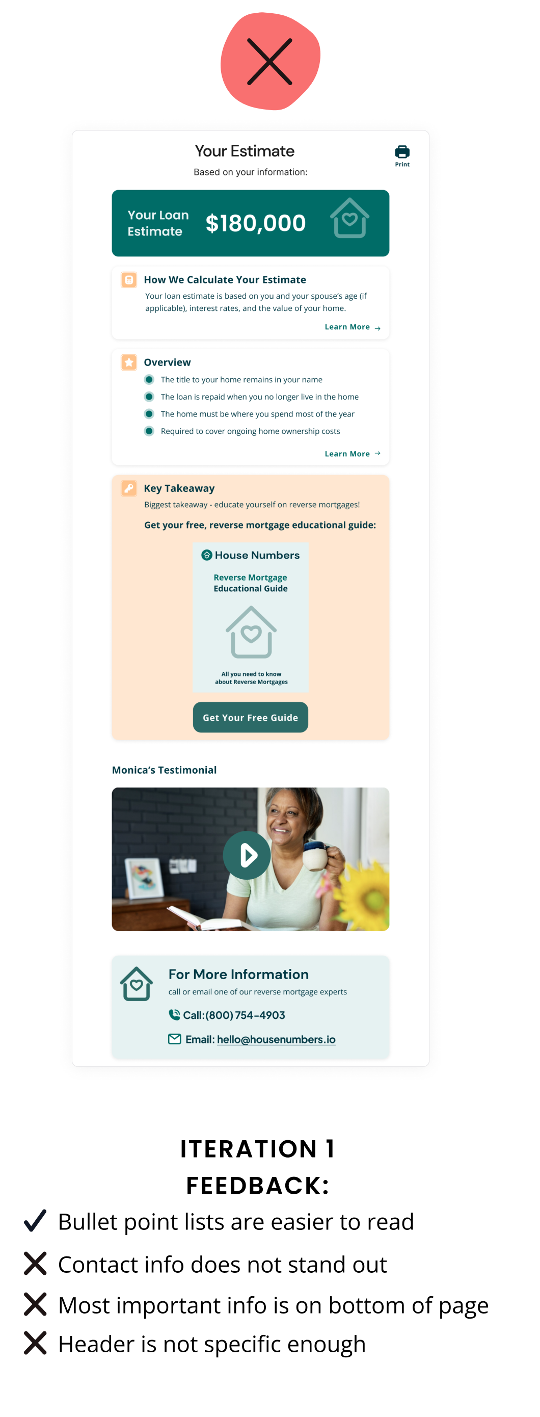
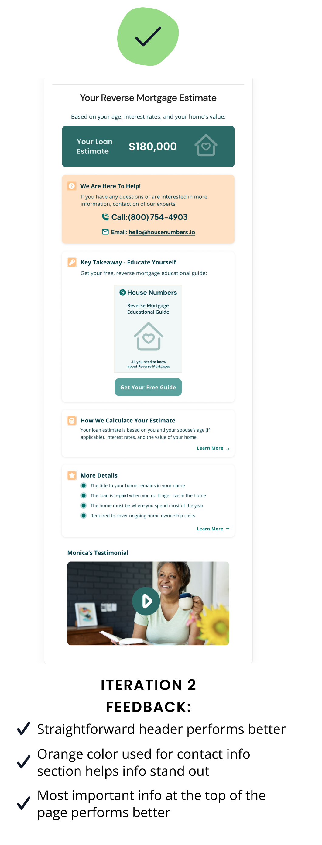
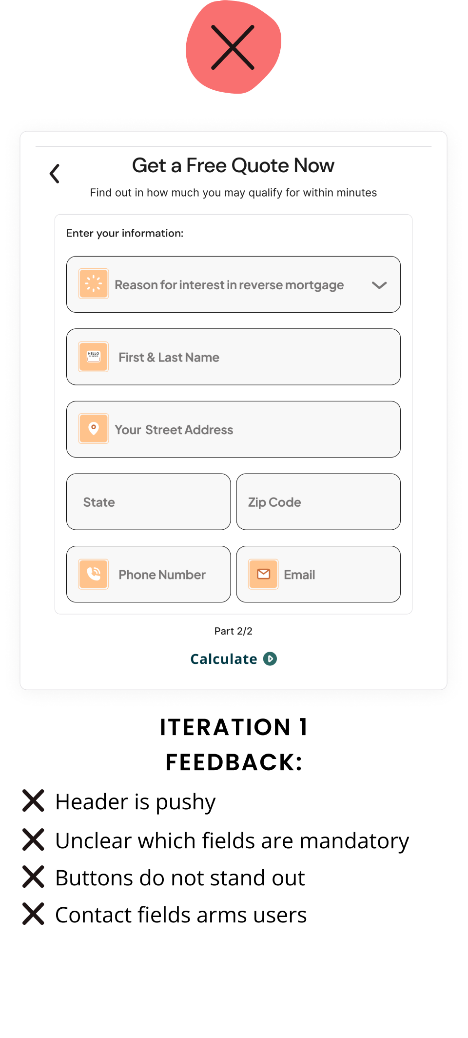
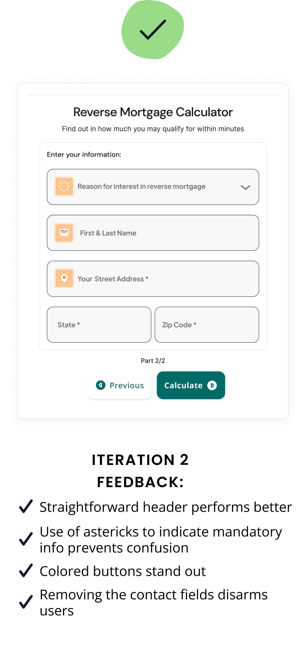
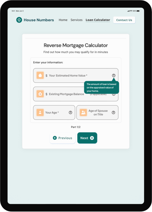
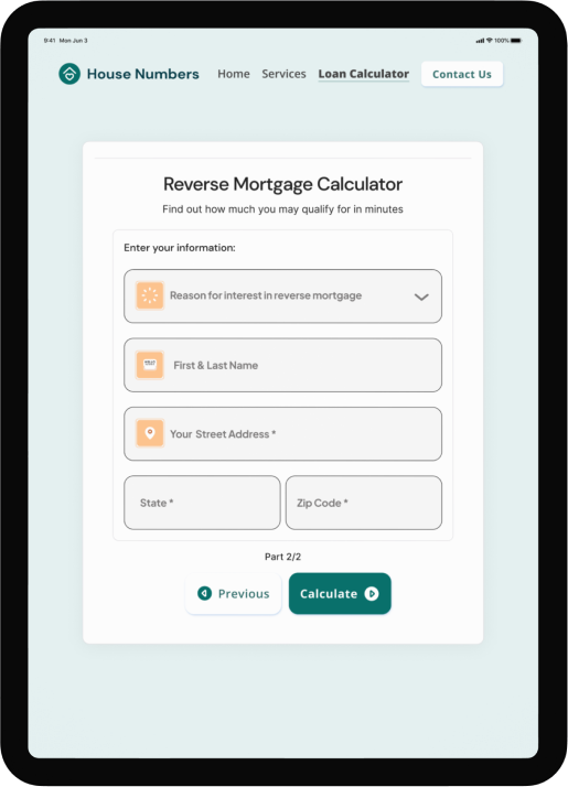
To help House Numbers complete this mission, I designed a reverse mortgage landing page, loan estimate calculator, and results page.

An iPad with the new design

Project goals

  • Educate senior homeowners on reverse mortgages
  • Gain trust of senior homeowners
  • Build user confidence in making a decision

The poor reputation of reverse mortgages

Interviewing five users to understand why reverse mortgages have a poor reputation

Affinity diagram

User pain points uncovered

#1. Lenders are not upfront with the obligations and logistics associated with reverse mortgages

#2. Lenders do not provide enough educational resources

Takeaways

Visualizing the connection between pain points and the user flow

Pain point #1

Lenders are not straightforward with the loan requirements and logistics

Storyboard

Ideas for solutions

Pain point #2

Lenders aren’t providing enough educational resources

Storyboard

Ideas for solutions

Visualizing solutions to pain points

How might we...

Display information in a way that is straightforward?
Build trust with the user?

Storyboard

How might we...

Educate users on reverse mortgages?
Make users feel confident in the information we provide?

Storyboard

Design validation: Usability testing

Usability testing with mid-fidelity wireframes

Mid-Fi icons
Usability testing with the following mid-fidelity wireframes:
  • Reverse mortgage landing page
  • Estimate calculator
  • Calculator results

User feedback from usability testing

The contact info is really far down the page - I don't think I would normally scroll this far. Calculating my estimate is quick and easy. The fact that I can calculate an estimate without talking to someone is convenient. Took me a second to find the calculator button. (calculator screen) Getting a Free Quote feels like they are trying to sell me something - do I have to talk on the phone with someone? I like how the information is listed - I can read it a lot faster. There is a too much text in basics part. It's taking me some time to find what I want.

Refining the design with feedback

Basics info iterations

Before the design iterating process After the design iterating process

Results page iterations

Before the design iterating process After the design iterating process

Reverse mortgage calculator iteration

Before the design iterating process After the design iterating process

Addressing the pain points

Final design of landing page, estimate calculator, and results page

House Numbers final design on iPad
Requirements and loan logistics are easy to find

To build trust with the users, the most important information is front and center on the landing page. The light orange color used for the icons was selected to attract attention, while comforting the user.

Free and accessible educational resources are provided

To build user confidence, I designed a reverse mortgage calculator that provides users with an instant estimate with an explanation of their current position.

House Numbers final design on iPad
Content and language is focused on educating vs. selling

To build trust with the users, I focused on providing content that educates the user on the full picture of reverse mortgages as opposed to cherry-picking the benefits.

Provided testimonials

To build trust with the users and to build confidence in House Numbers, testimonials are provided throughout the website.

House Numbers final design on iPad

Takeaways and highlights

  • Actively practicing empathy is one of the most important processes when designing an intuitive, accessible user experience
  • Color is a powerful tool in influencing your user's emotions and capturing their attention
  • Open space and small amounts of text increases readability for senior users
  • Contact information should be easy to find and provided in various places
  • Senior users are more likely to have a positive website navigation experience when the pages have minimal details and fewer distractions
Icon of a heart inside of a house